
After a spell without them, third jerseys are back for the NHL! Now, that may cause fear to rise in your gullet. At least it will if you are old enough to remember that first wave of (largely hideous) third jerseys from the ‘90s. Somehow, the Anaheim Mighty Ducks managed to make themselves look even worse! The NHL didn’t have alternate/third jerseys last year due to switching all their jerseys to Adidas. Now Adidas is able to crank out third jerseys for what is expected to be about 15-20 teams. Some of the looks have been seen before but not for the past few years. Here’s a look at all the third jerseys we know about, ranked in terms of quality.
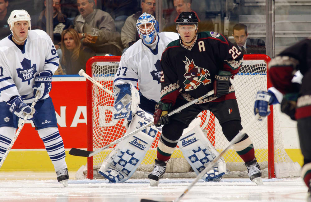
Apparently we’re at a place where we’re willing to nostalgically accept these Coyotes jerseys as existing? Until they changed their look to a simpler style, Arizona, then Phoenix, was rivaled by only the Minnesota Wild for worse look in the league. We don’t care if they’re ironically bringing back the Kachina jerseys. They still look bad and are WAY too busy for a sports uniform.
Sorry, we aren’t going to buy your nostalgia, take two. The Anaheim logo with the duck-shaped hockey mask was dumb then, and it’s dumb now. However, the purple-and-teal look feels like it has aged a little better. The stripes are nice. The logo is still hot garbage.

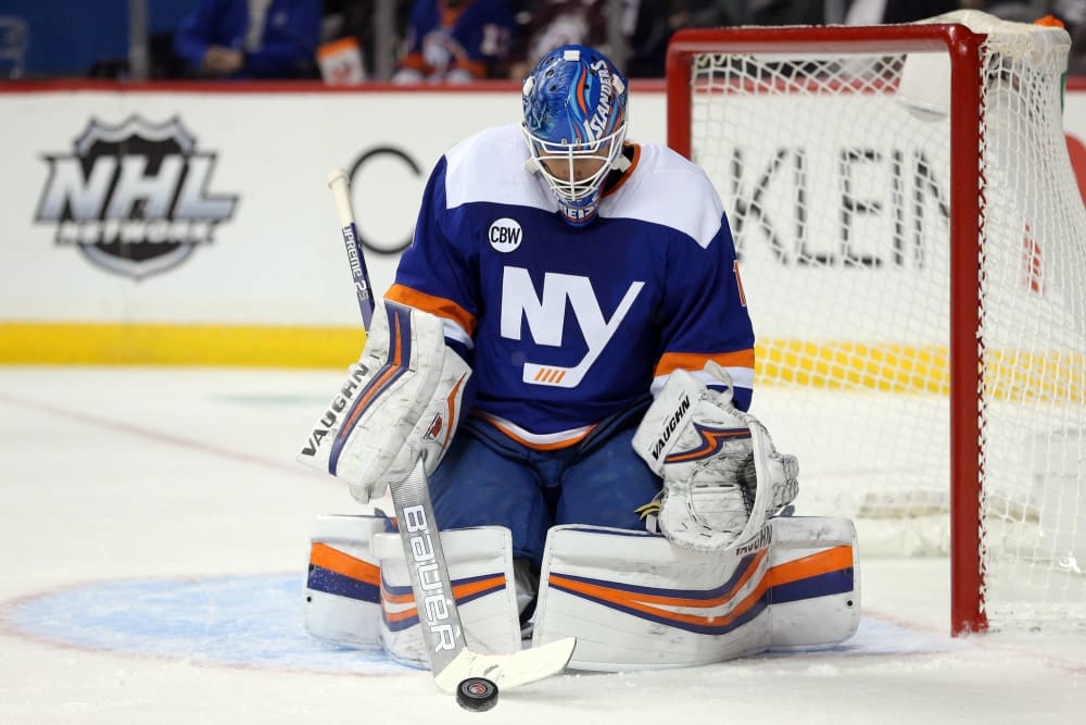
There are two things going against the Islanders’ third jerseys. One, it’s basically a replicant of the black third jersey they wore before, but now it’s blue. Two, it’s not an interesting logo, and it’s much worse than the traditional Islanders logo. It also lacks the kitschy fun of the fisherman logo. Just blah all around.
These jerseys are too basic to be offensive but also too boring to be interesting. They look fine. This is a shrug in hockey jersey form. They better wear it around Halloween.
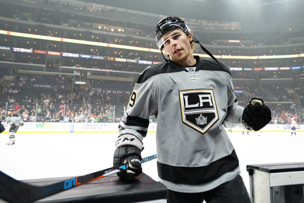
Straight up, we miss the yellow-and-purple crown look from the expansion era. Instead of that, the Kings are going with another gray alternate, a slight tweak from their 50th anniversary look. It’s not a bad look, but it doesn’t really stir up much in the way of feelings.
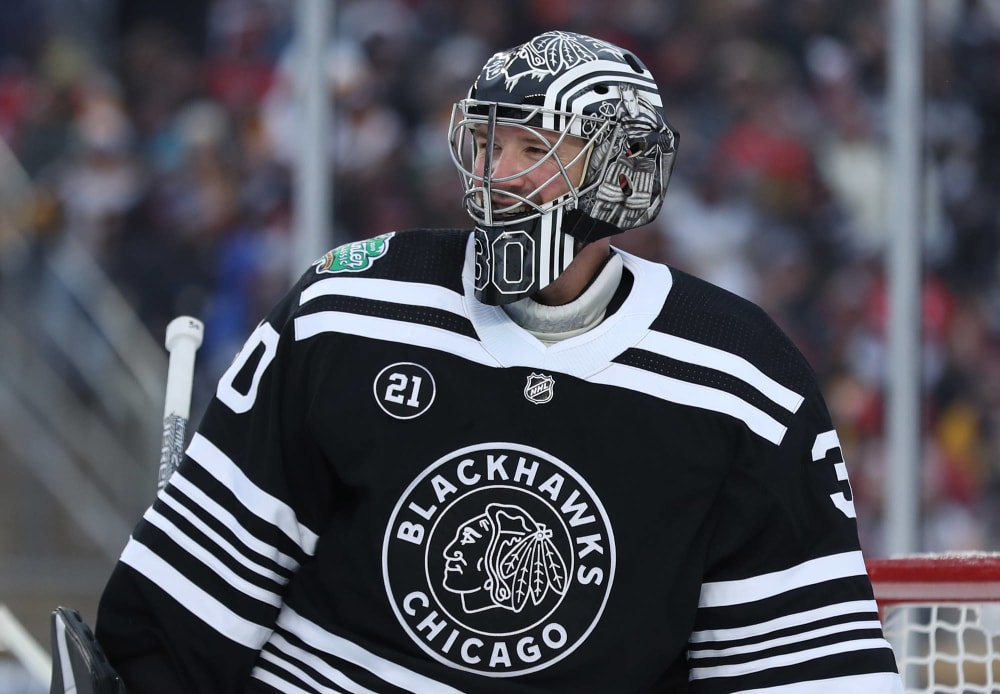
The Blackhawks and the Bruins aren’t wearing third jerseys, per se, but they did wear retro looks for the Winter Classic. Both are harkening back to their ‘30s looks. These Chicago ones are kind of crazy because they are just black and white. A Blackhawks jersey without a hint of red? That’s practically sacrilege!
The Oilers’ jersey is good and a reflection of their old look for their 40th anniversary. However, it’s not all that different from their usual look. They are just wearing a bright royal blue with the orange. It pops, but it’s not different enough to rank too high.

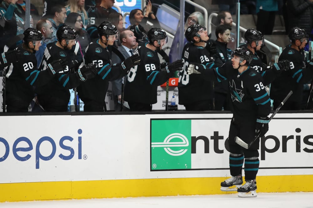
Shocker! The Sharks have a black alternate jersey. Back in the day, “third jersey” basically meant “black jersey,” but now that isn’t the case so this isn’t quite as eye-rolling. They also have made the new logo blacker as well, borrowing from the aesthetic choices of “Spinal Tap.” And there’s a new shoulder logo with a fin poking out of the water, which is actually cool.
Everything is terrible about the Senators…save for their expected third jersey. They are bringing back their centennial look, which has a great old school vibe. Their logo is just a big “O.” The simplicity works.

Like a character from the least-popular Austin Powers movie, the Penguins seem to love gold. That being said, these jerseys really pop. They are bright but not garish, and gold is deeply tied to Pittsburgh sports. The Stanley Cup may be silver, but gold still has its charm in the NHL.

The Jets’ look is cool. The blue they usually sport works great, the lettering of the logo is sharp, and I really like the stripe. It definitely is a classy jersey, but the Jets have such a good look normally, it feels like an unnecessary alternative.

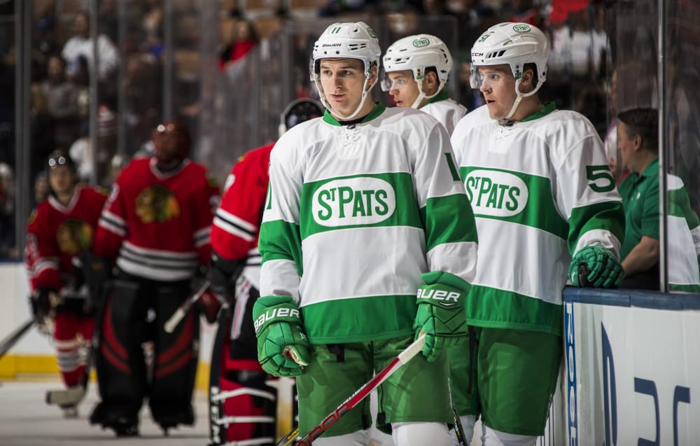
Toronto is expected to kick it very old school again by busting out its St. Pats jerseys, a shout out to a defunct hockey team based in the city. Hey, you can always wear it on St. Patrick’s Day and have it be a hit. It’s weird to see the Maple Leafs not wearing blue, but to be fair they also aren’t even wearing the words “maple” or “leafs.” That’s fun in and of itself, and the St. Pats jerseys are pretty nice as well
By: Chris Morgan